RKS Design
Elevating Industrial Design Through Minimalism
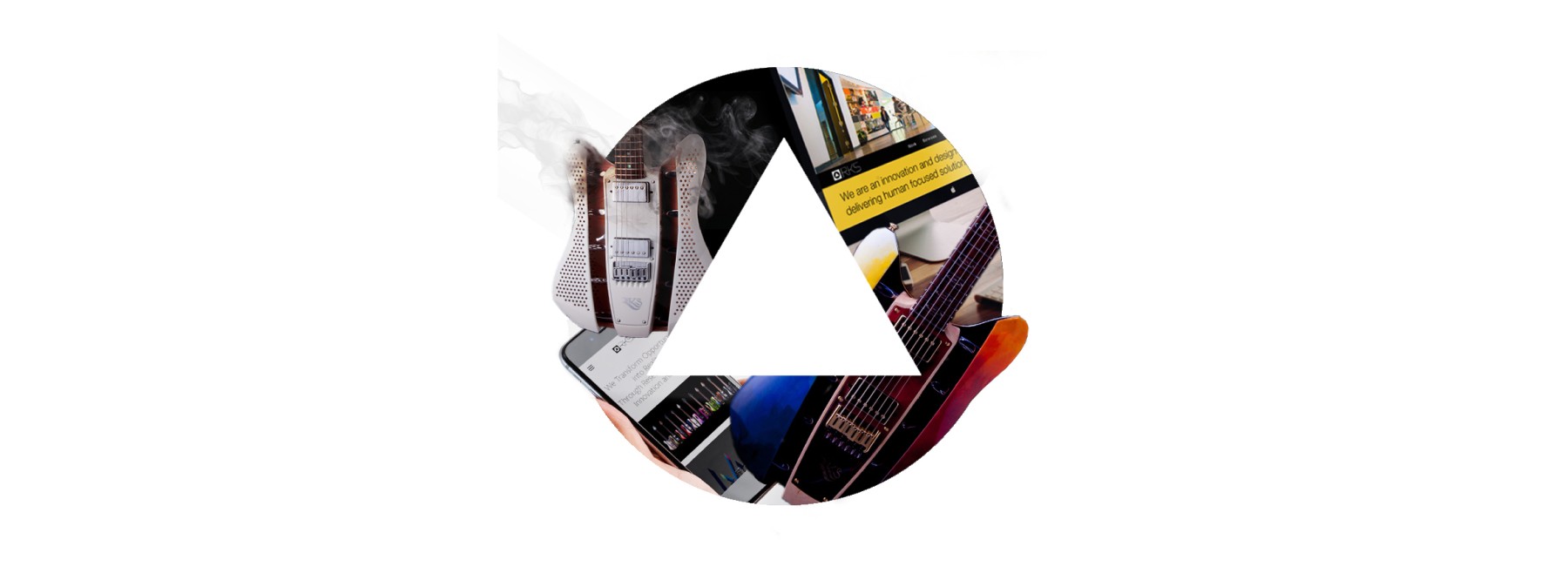
RKS Design, a renowned industrial design agency based in Southern California, has been at the forefront of innovation for 44 years. The company specializes in creating emotional connections through its products, merging market relevance with brand building. With a focus on human-centered design, RKS has established itself as a leader in strategic design and innovation, offering expertise in industrial design, product development, and engineering.
Redefined the visual identity of RKS Design, a top-tier industrial design firm, through a fresh, minimalist brand refresh
Collaborated directly with the CEO to craft a modern, cohesive identity system that positioned RKS as both timeless and forward-thinking.
Align digital and print collateral with the company’s values of innovation
SITUATION
Initial Findings
A Brand Poised for Modernization
RKS Design had a 44-year legacy of strategic product innovation and needed a refreshed brand to match its evolved design vision. The opportunity was to create a modern and elegant identity that reflected the firm's human-centered approach and industry leadership.
How Might We
Present RKS as both a heritage firm and an evolving innovation partner?
Use minimalism to express depth, clarity, and emotional resonance?
Align visual branding with RKS’s multidisciplinary services and cross-industry impact?
TASK
What We Had to Solve
Create a Unified, Minimalist Identity
The challenge was to create a brand identity that would break from outdated aesthetics without alienating clients seeking professionalism. The identity had to look credible in boardrooms yet flexible for digital platforms and growing markets.
Differentiate in a Crowded Market
Our task was to identify where Manrkē could stand out, not just visually, but emotionally. We aimed to build a system that could evolve with the brand as it scaled across industries and geographies.
ACTIONS
How We Tackled It
01
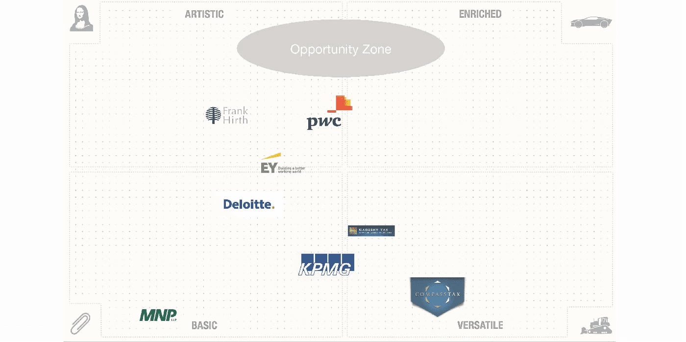
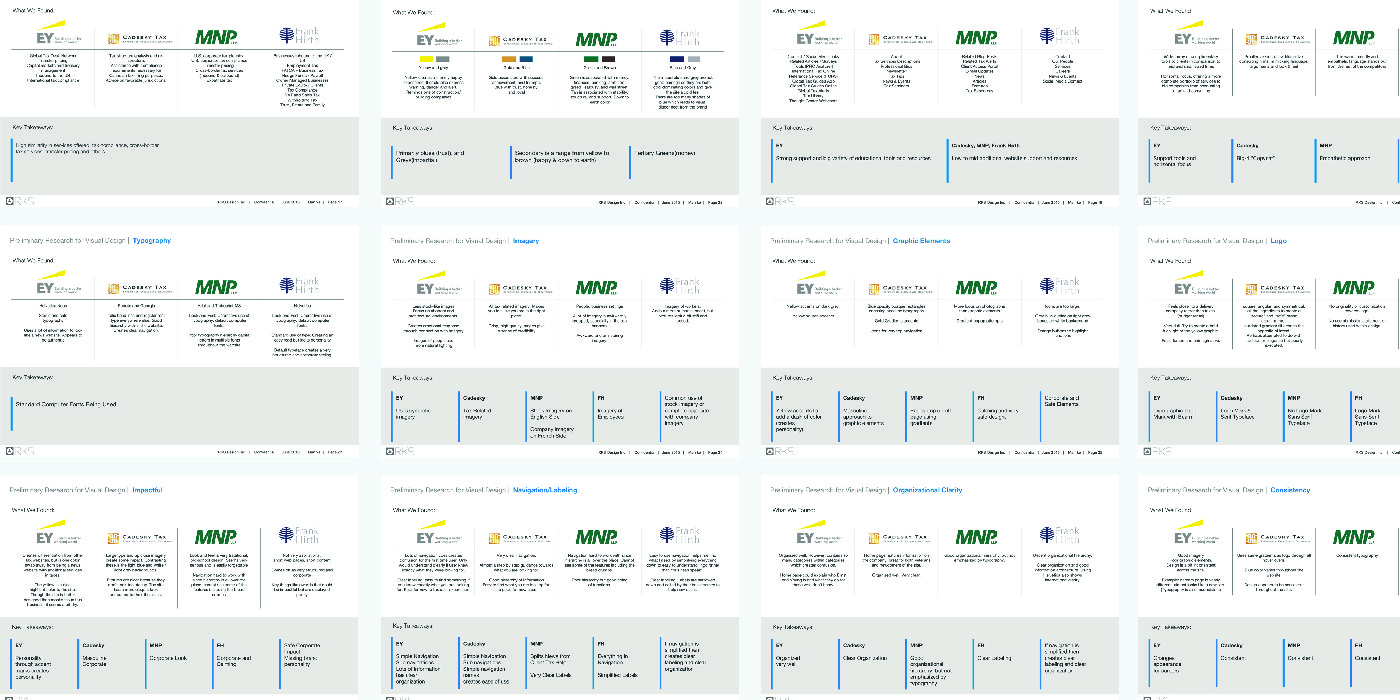
Benchmarking the Industry
Analyzed branding and messaging from four leading CPA firms to understand patterns in visual tone, typography, and trust signals. Evaluated design choices through the lens of client perception, usability, and strategic alignment.
02
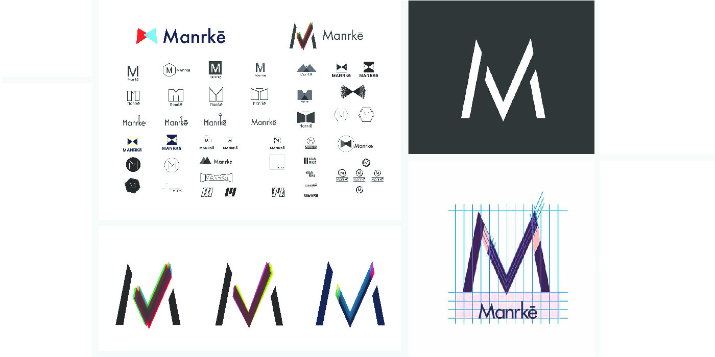
Exploring Visual Possibilities
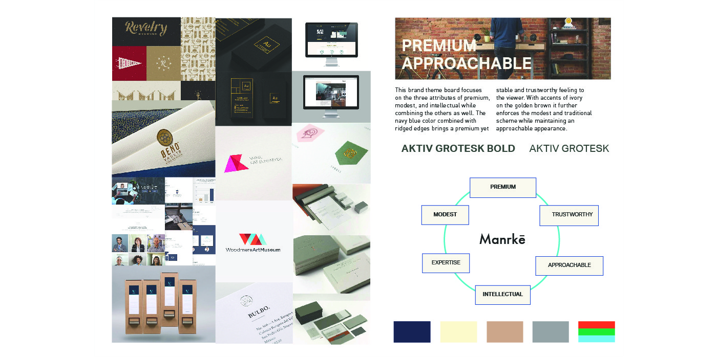
Sketched and prototyped multiple logo directions and graphic systems to capture both credibility and character. Moodboards tested combinations of color, type, and imagery to ensure the final direction aligned with Manrkē’s values.
03
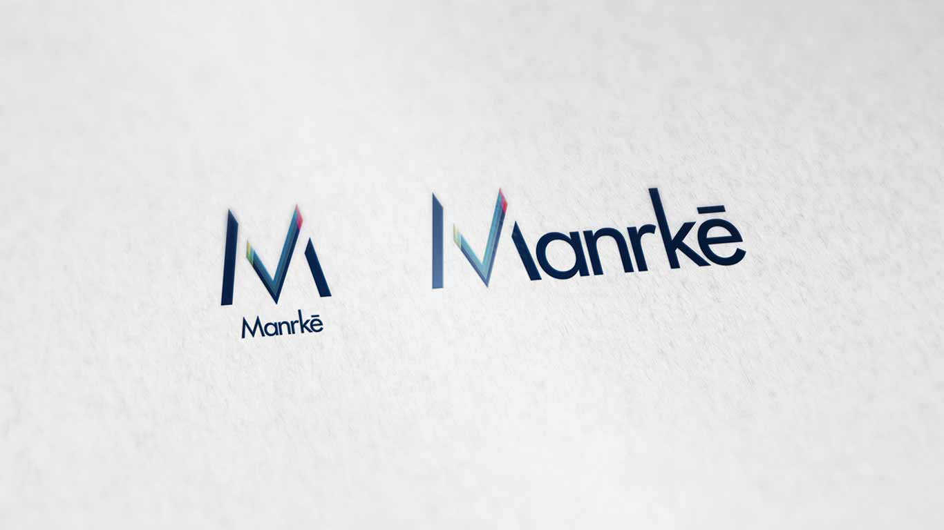
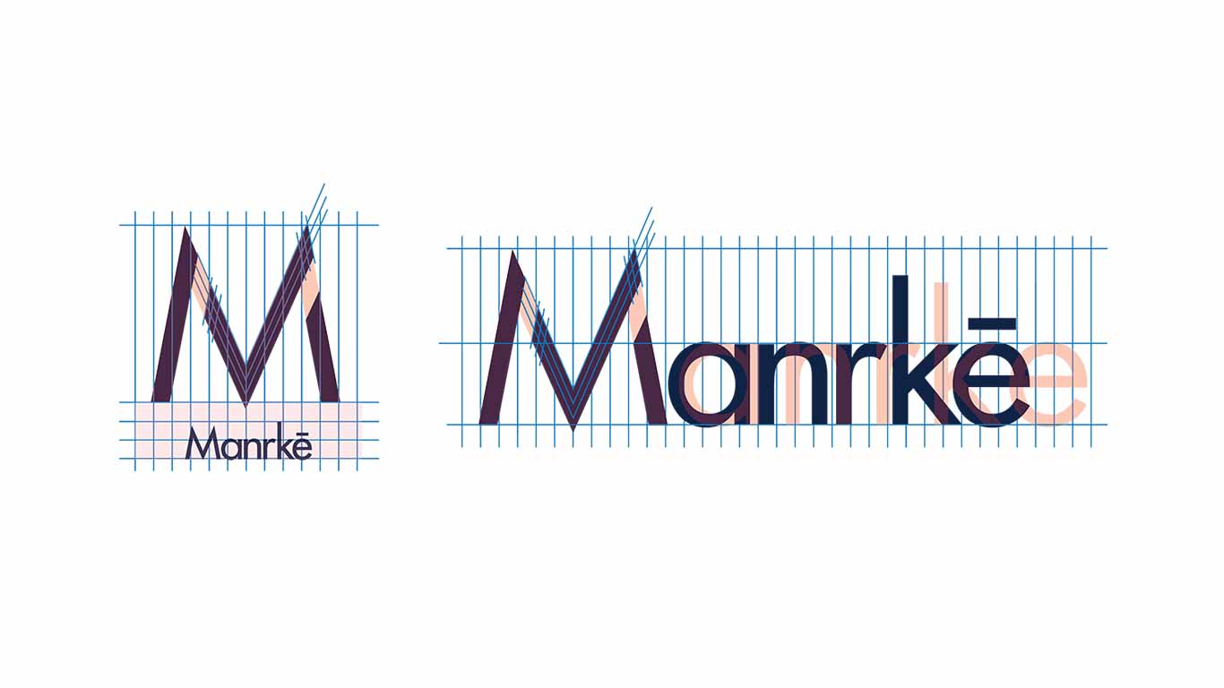
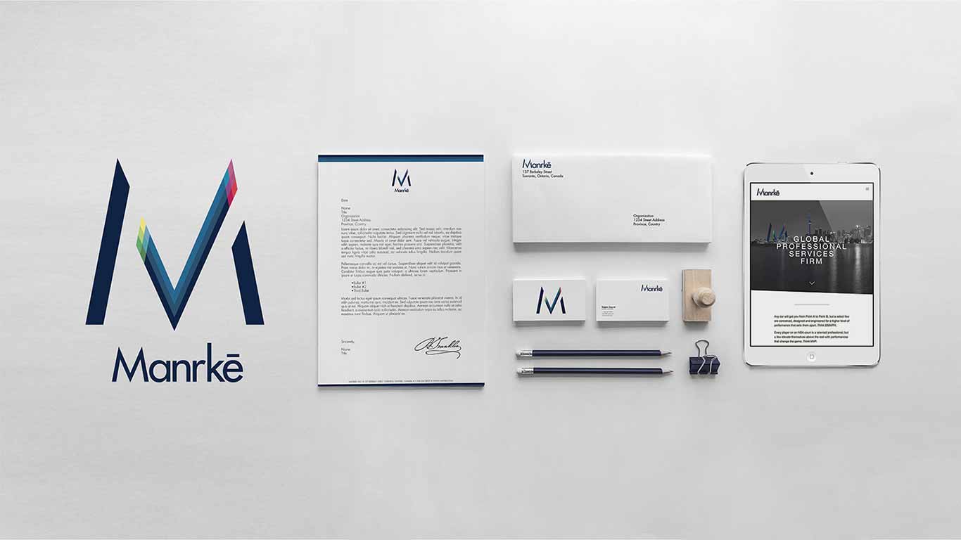
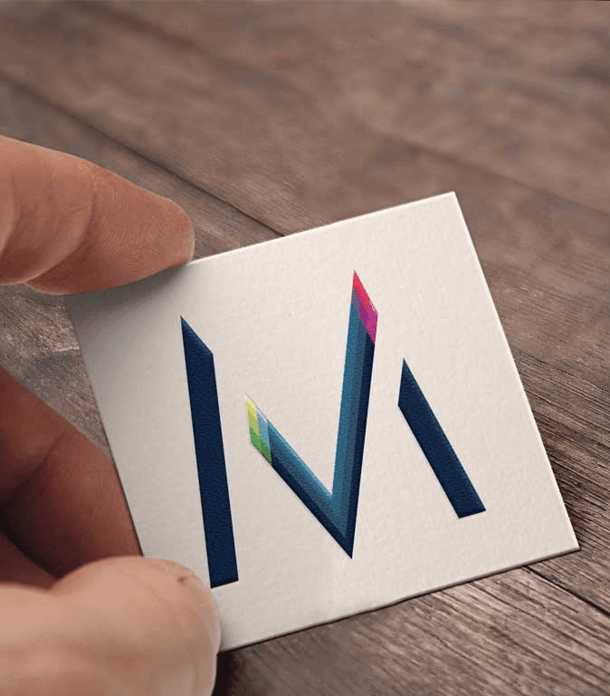
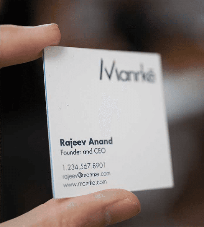
Designing the Identity System
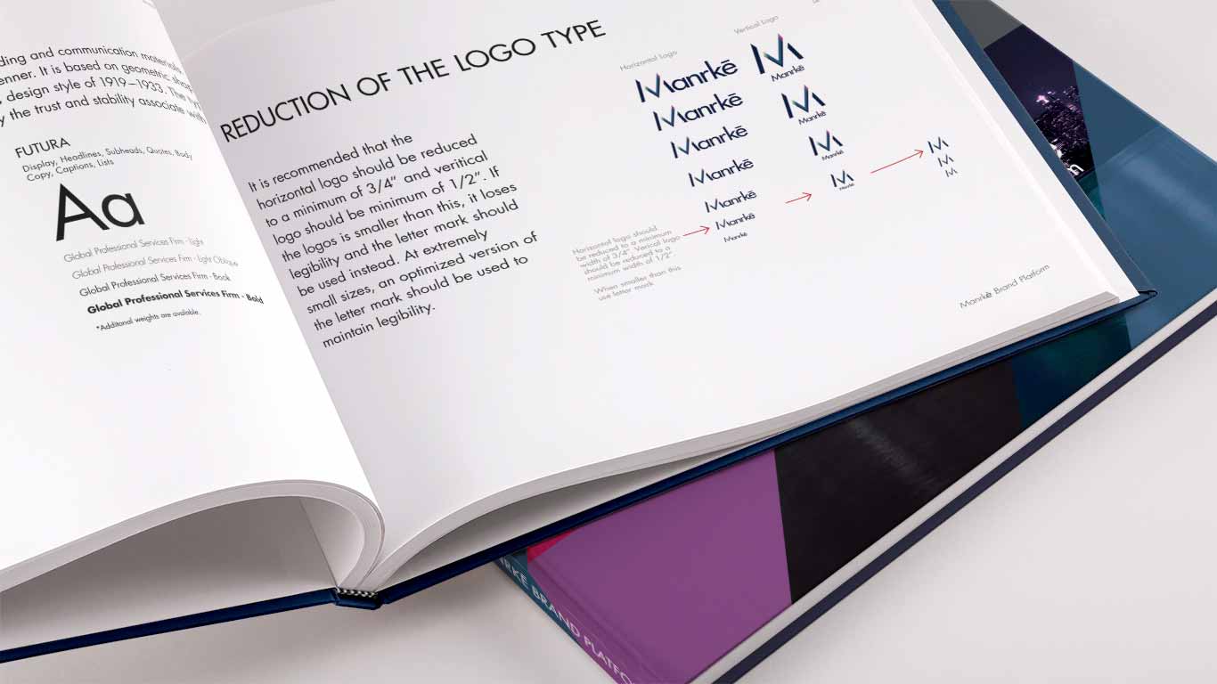
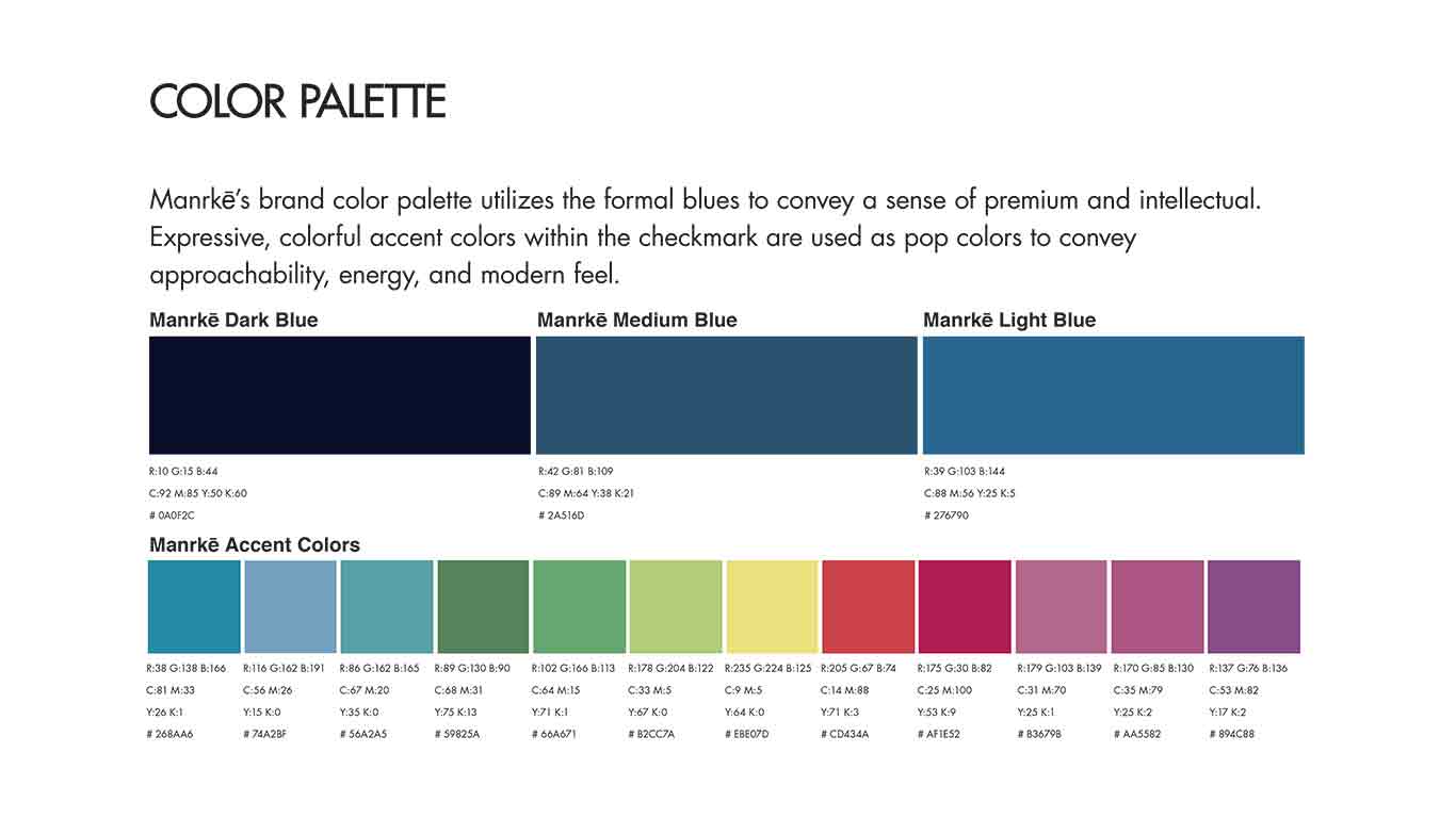
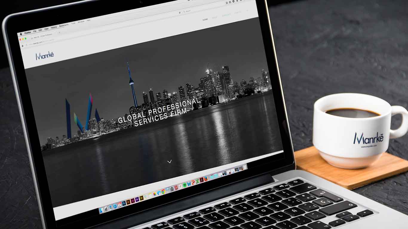
Created a minimalist logo with clean geometry and refined typography to convey structure, intelligence, and modernity. Selected a color palette that balanced calm authority with subtle warmth, paired with flexible grid systems and scalable iconography.

04
Building the Brand Guidelines
Documented typography, spacing rules, visual hierarchy, and application scenarios across digital and print. Guidelines were designed for internal and external use to ensure cohesion as the brand scaled.
Result
The Outcome
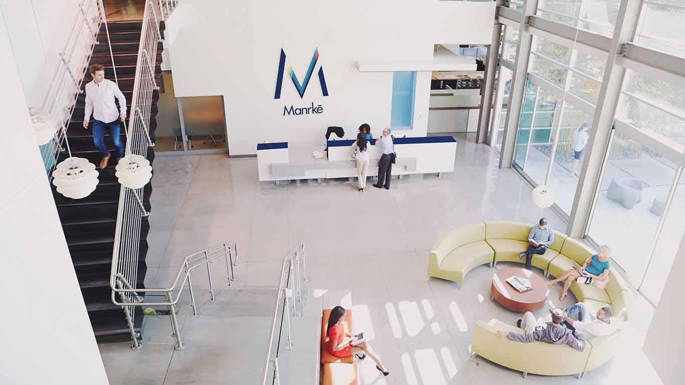
Launched a Distinctive, Professional Brand
Positioned Manrkē as a Market Standout
Built a Scalable, Cohesive Brand System
REFLECTION
What I Learned
Branding as a Strategic Tool
This project deepened my understanding of how visual design can challenge expectations and open new markets — even in conservative industries.
Designing for dual perception — traditional and progressive — is a delicate balance that starts with research and empathy.
Collaboration Creates Clarity
Close communication with the Manrkē team helped translate their abstract goals into tangible, visual language. I learned that strong brands aren’t just designed, they’re co-created with those who believe in the mission.
Challenge
The primary challenge was to modernize RKS Design's brand identity while maintaining its rich legacy and reputation for innovation. We needed to create a cohesive visual language that would resonate across all touchpoints, from digital platforms to print materials. Additionally, we faced the task of simplifying complex design concepts into a minimalist aesthetic that would appeal to both clients and industry professionals
Solution
To address these challenges, I collaborated closely with the CEO and fellow designers to implement a minimalist approach to the agency's visual identity. We embraced the philosophy of "less is more," focusing on clean lines, ample white space, and a refined color palette. Our strategy involved a comprehensive redesign of the website, marketing content, and print collaterals to ensure a consistent and sophisticated brand voice.


Outcome
The rebranding effort resulted in a more sophisticated and distinguished identity for RKS Design. The new minimalist aesthetic effectively communicated the agency's expertise in industrial design and innovation. The redesigned website and marketing materials showcased RKS's portfolio in a more impactful way, highlighting the emotional connections created through their products. This cohesive brand identity not only set RKS apart from competitors but also reinforced its position as a top product design firm and innovation consulting leader
What I Learned
I gained valuable insights into the transformative power of minimalism in brand identity. By embracing a "less is more" approach and focusing on clean lines, ample white space, and a refined color palette, we were able to create a cohesive visual language that effectively communicated RKS Design's expertise in human-centered industrial design and innovation. This experience underscored the importance of aligning brand identity with a company's core values and unique selling propositions.