
Khoa Nguyen
Menu

RKS Design
Elevating Industrial Design Through Minimalism
RKS Design, a renowned industrial design agency based in Southern California, has been at the forefront of innovation for 44 years. The company specializes in creating emotional connections through its products, merging market relevance with brand building. With a focus on human-centered design, RKS has established itself as a leader in strategic design and innovation, offering expertise in industrial design, product development, and engineering.
Role: UX/UI Designer
Shipped: 2016
Keyword: UX Research, User Testing, Design System, UX/UI Design
My Role
As the Lead Graphic/Brand Designer, I led the creation of Manrke's visual identity. My responsibilities included conducting competitive analysis, developing the visual aesthetic, and designing the logo and brand elements. Throughout the project, I collaborated closely with the Manrke team to ensure the final product accurately represented their vision and values.
Challenge
The primary challenge was to design a brand that balanced professionalism with approachability. We needed to create a visual identity that would set Manrke apart from competitors while still inspiring trust in potential clients. The goal was to infuse fresh, energetic elements into a traditionally conservative industry without compromising the firm's credibility.
Research
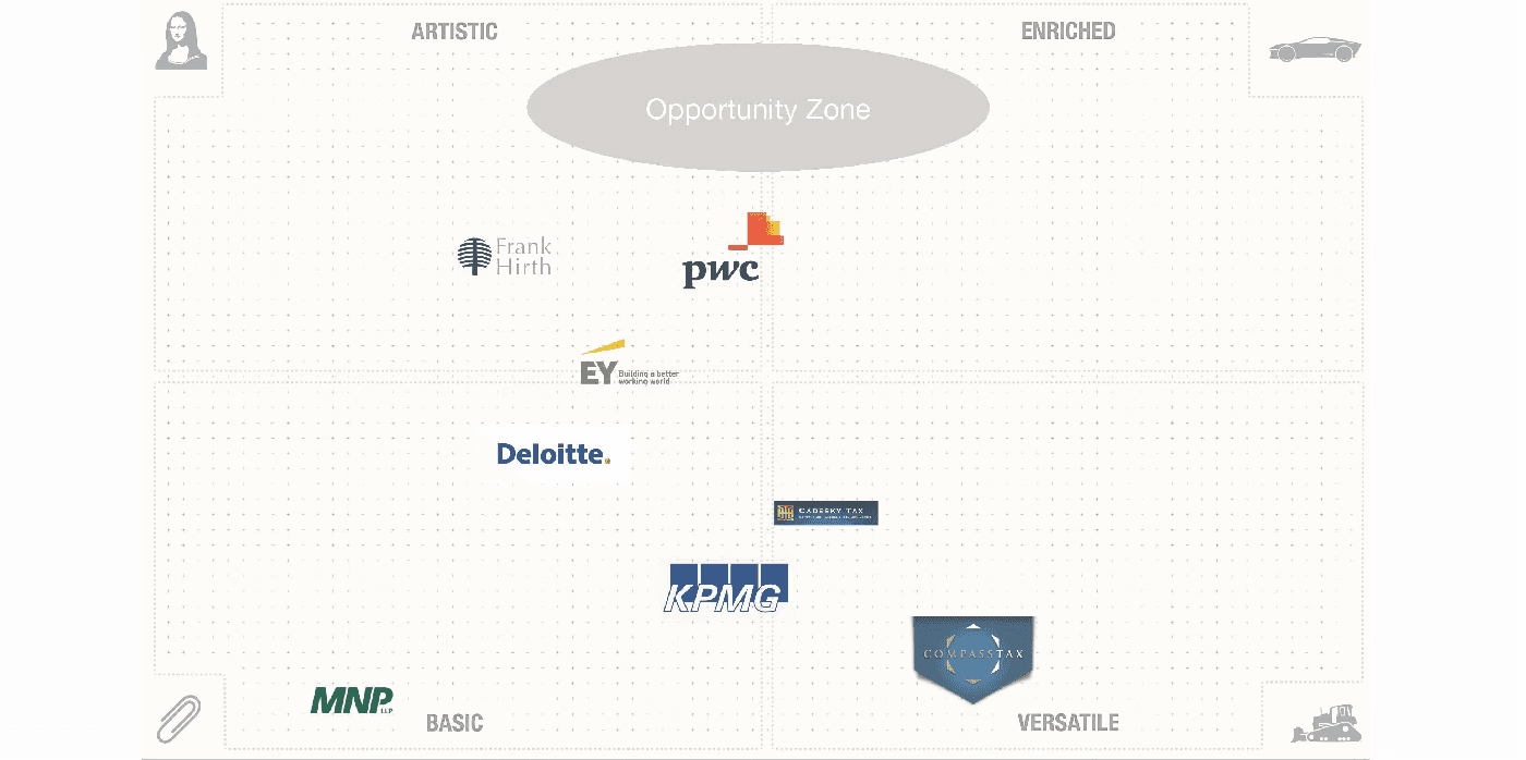
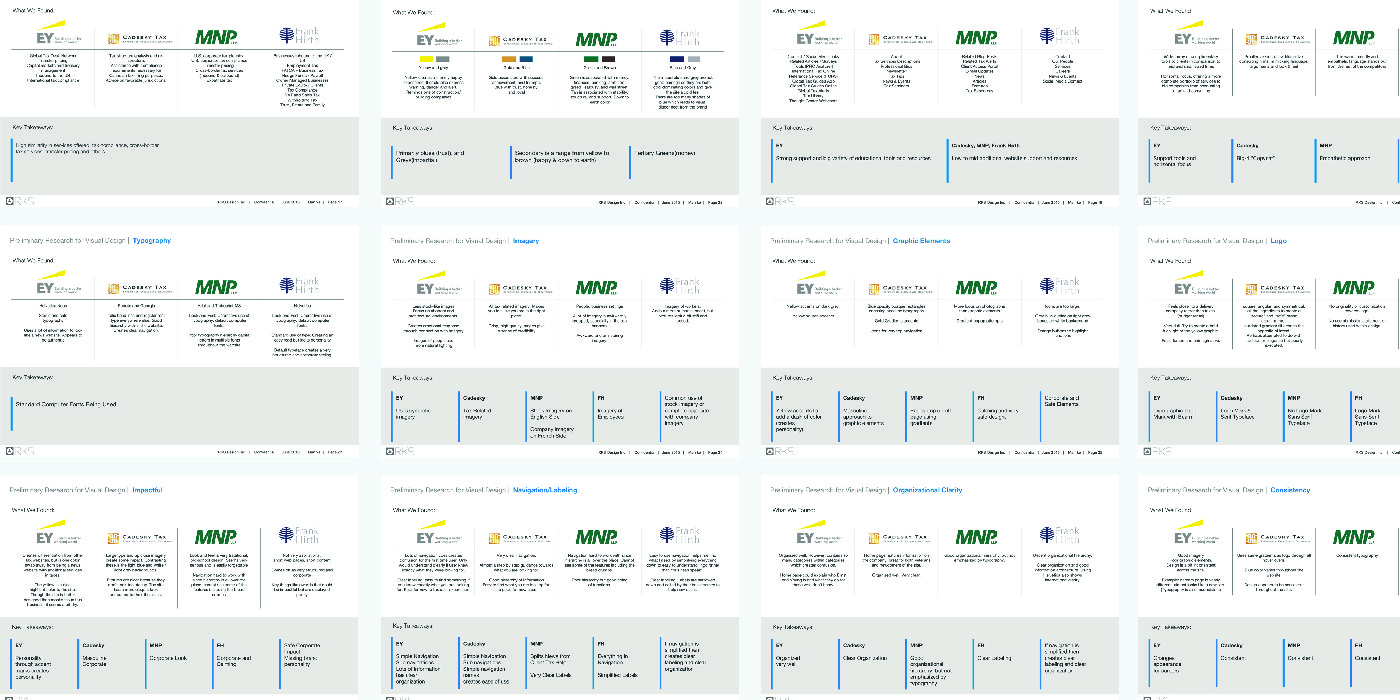
Our research phase began with a comprehensive competitive analysis of the four main players in the CPA industry. We examined their visual designs, including logos, color schemes, imagery, and typography. Additionally, we evaluated the overall brand experience, assessing factors such as impact, services offered, functionality, and consistency. This analysis provided us with a clear picture of the industry landscape and helped identify opportunities for Manrke to differentiate itself.
Ideate
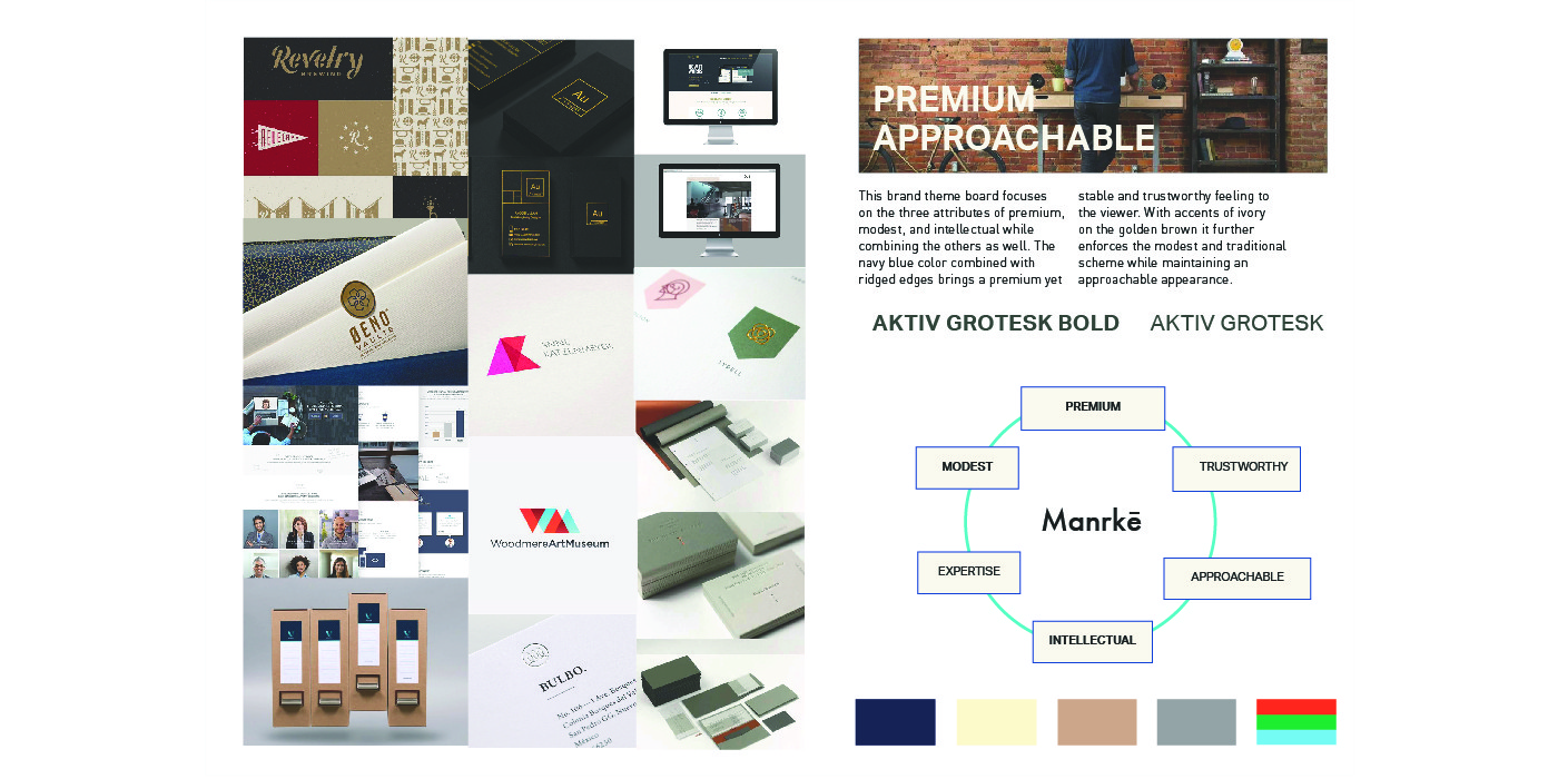
Building on our research findings, we focused on creating a visual aesthetic that would maintain the industry-standard level of trustworthiness while incorporating Manrke's unique personality. We explored various design concepts that blended professionalism with approachability. Our ideation process involved brainstorming sessions, sketching, and digital mockups to visualize different ways of expressing Manrke's core values through visual elements.
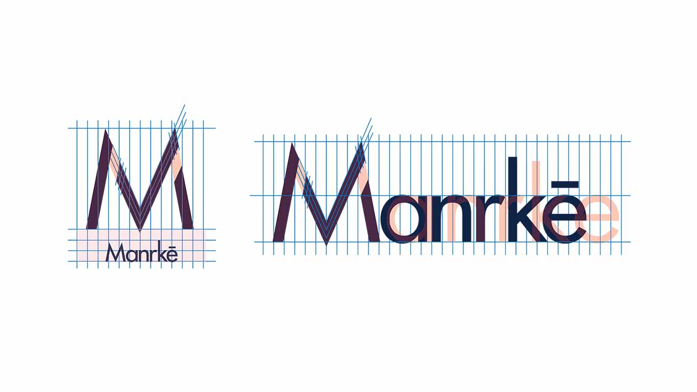
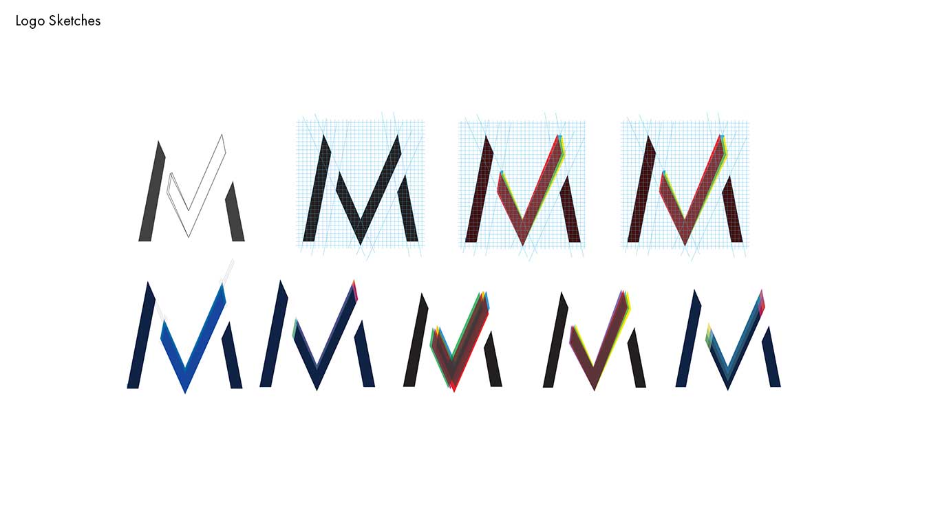
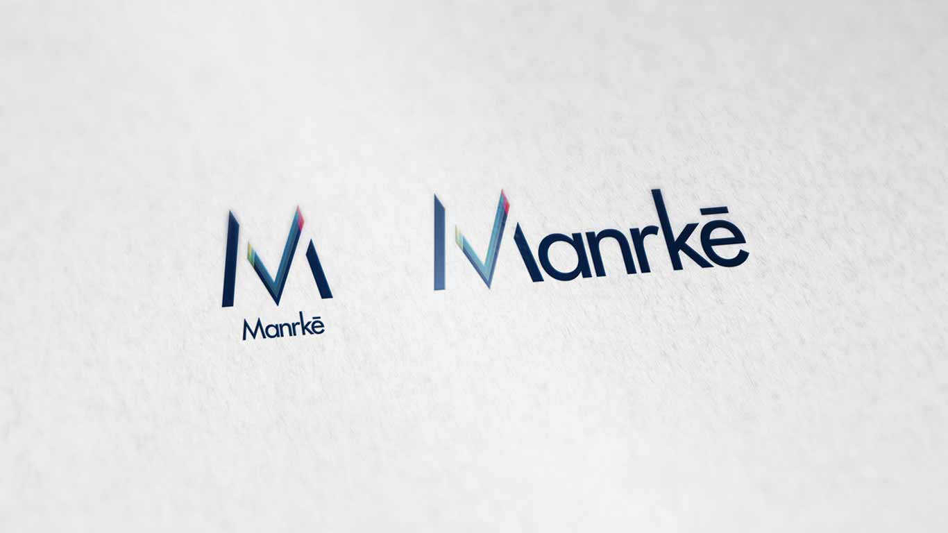
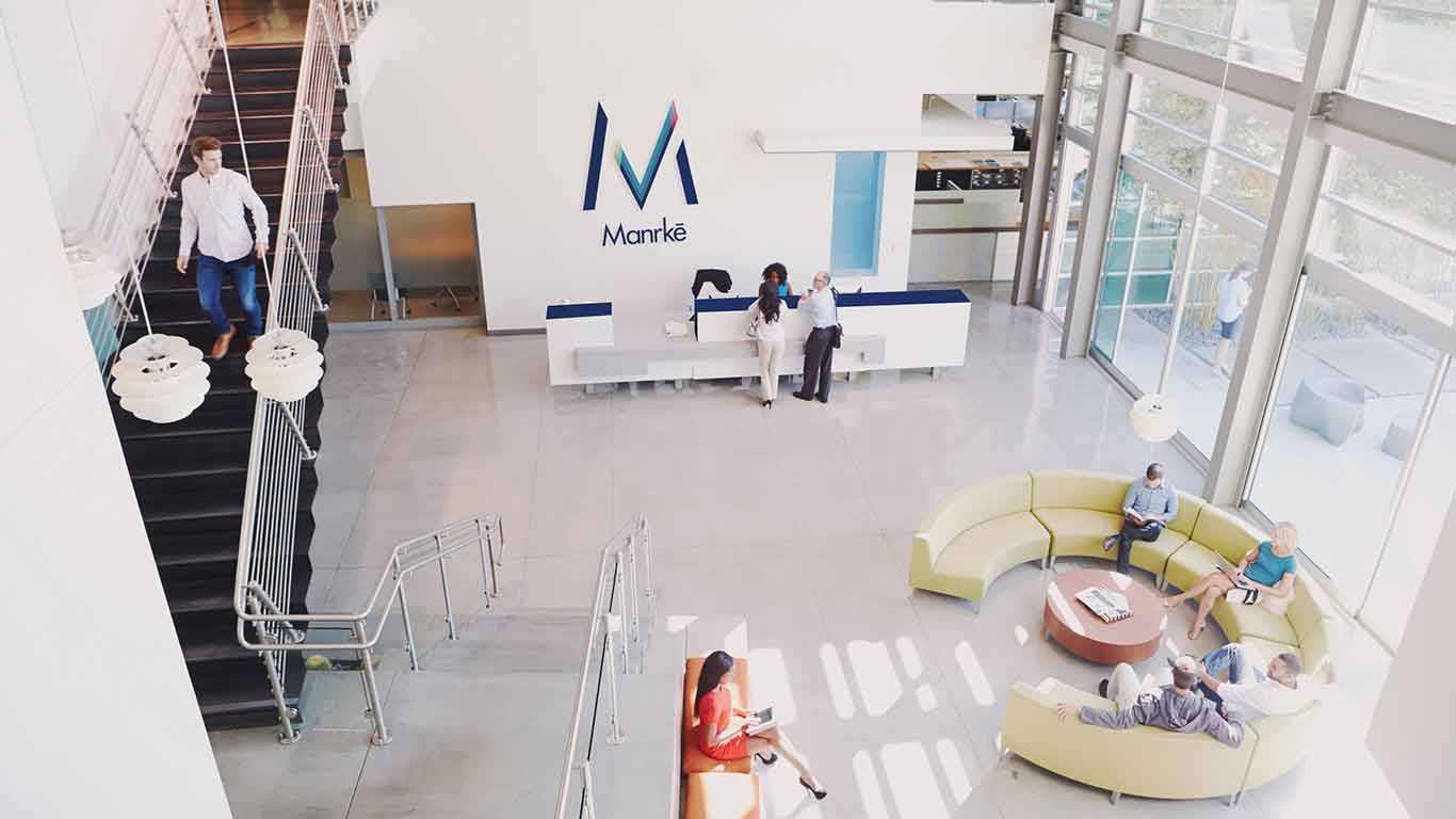
Solution
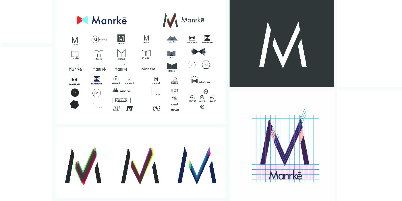
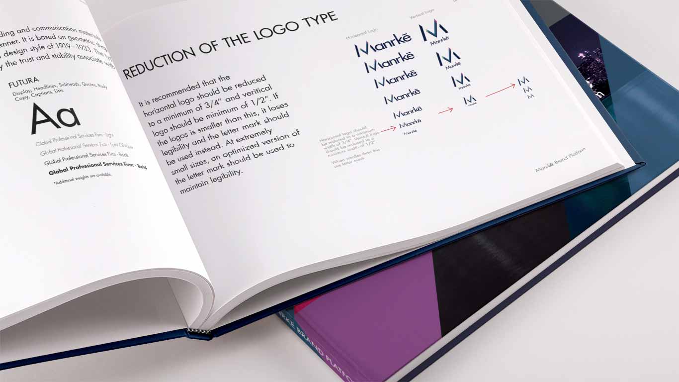
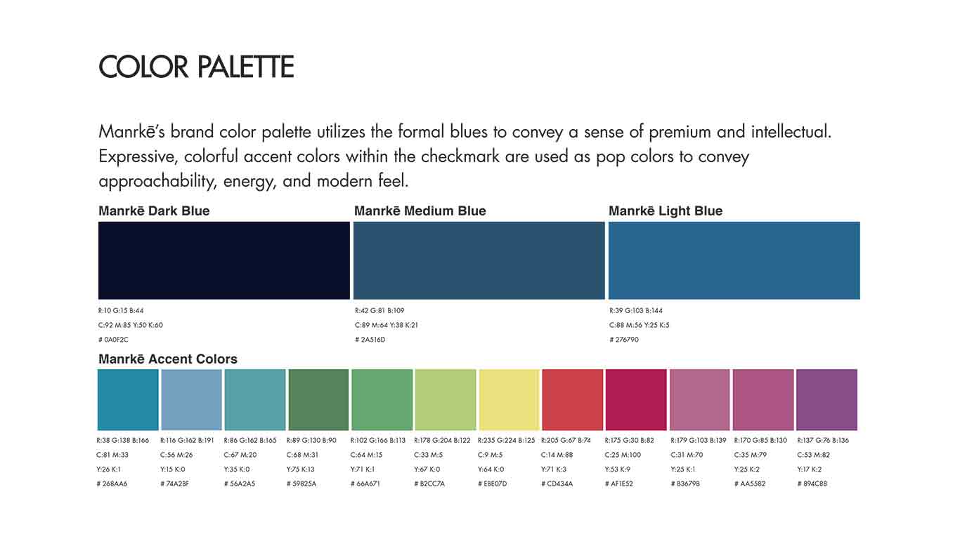
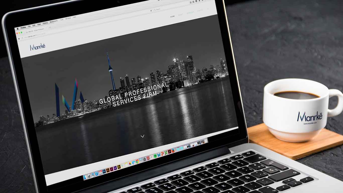
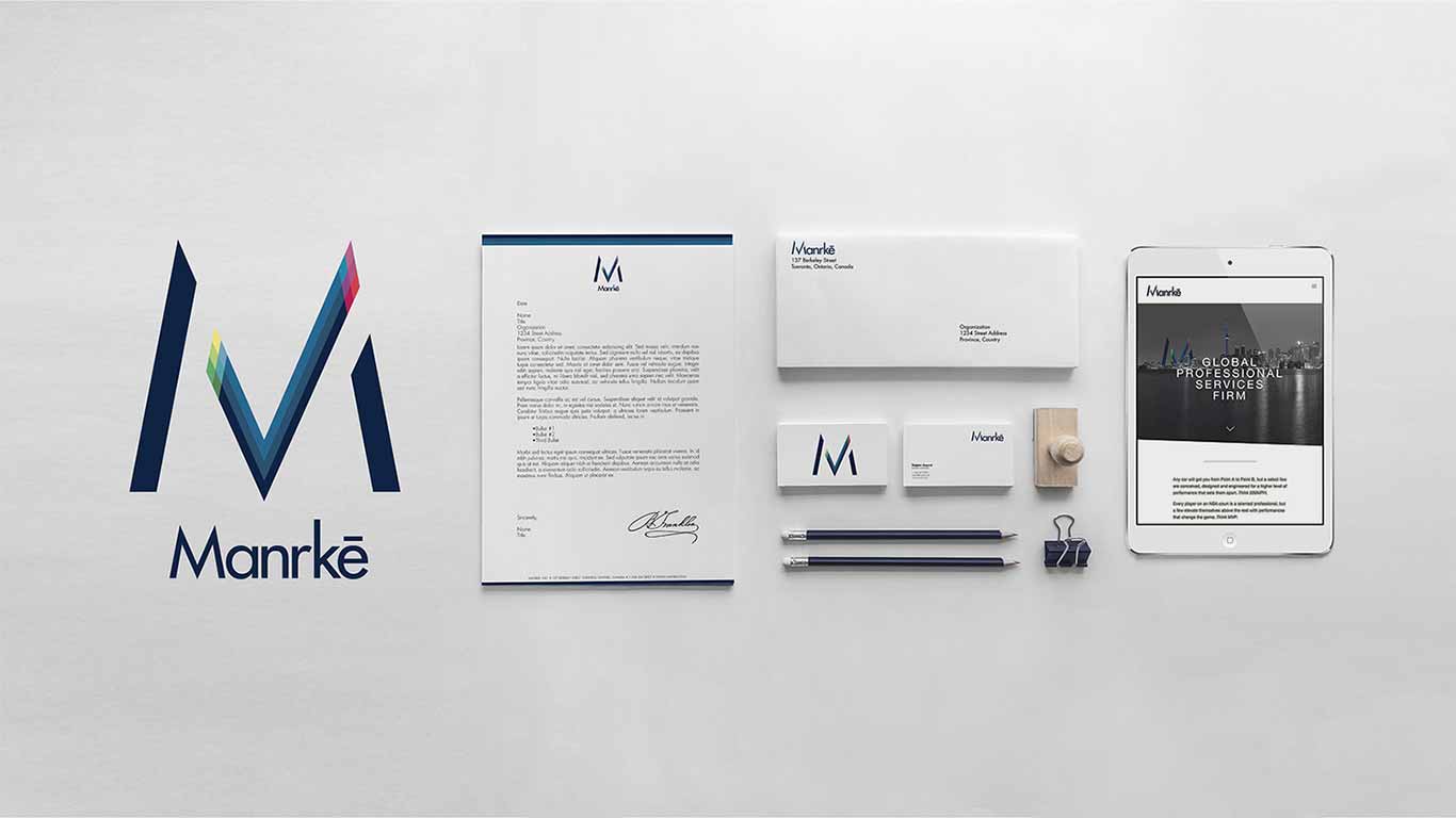
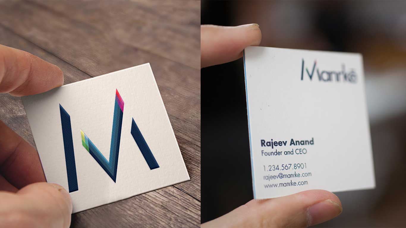
We developed a brand identity that combined elements of stability and premium quality with a modern, approachable feel. The logo design incorporated clean lines and a sophisticated color palette to convey professionalism, while subtle dynamic elements were added to represent Manrke's energetic approach. We created a comprehensive brand guide that included typography, color schemes, and graphic elements to ensure consistency across all touchpoints.
Outcomes
What I Learned
I learned the importance of balancing tradition with innovation in brand identity creation for professional services. The experience reinforced the value of thorough competitive analysis and close collaboration with the client to develop a visual language that truly represents their unique positioning. Most importantly, this project demonstrated how strategic design choices can help a company differentiate itself in a conservative industry while maintaining credibility and trust.
Read next


RKS Design
Elevating Industrial Design Through Minimalism
RKS Design, a renowned industrial design agency based in Southern California, has been at the forefront of innovation for 44 years. The company specializes in creating emotional connections through its products, merging market relevance with brand building. With a focus on human-centered design, RKS has established itself as a leader in strategic design and innovation, offering expertise in industrial design, product development, and engineering.
Role: UX/UI Designer
Shipped: 2016
Keyword: UX Research, User Testing, Design System, UX/UI Design
My Role
As the Lead Graphic/Brand Designer, I led the creation of Manrke's visual identity. My responsibilities included conducting competitive analysis, developing the visual aesthetic, and designing the logo and brand elements. Throughout the project, I collaborated closely with the Manrke team to ensure the final product accurately represented their vision and values.
Challenge
The primary challenge was to design a brand that balanced professionalism with approachability. We needed to create a visual identity that would set Manrke apart from competitors while still inspiring trust in potential clients. The goal was to infuse fresh, energetic elements into a traditionally conservative industry without compromising the firm's credibility.
Research
Our research phase began with a comprehensive competitive analysis of the four main players in the CPA industry. We examined their visual designs, including logos, color schemes, imagery, and typography. Additionally, we evaluated the overall brand experience, assessing factors such as impact, services offered, functionality, and consistency. This analysis provided us with a clear picture of the industry landscape and helped identify opportunities for Manrke to differentiate itself.
Ideate
Building on our research findings, we focused on creating a visual aesthetic that would maintain the industry-standard level of trustworthiness while incorporating Manrke's unique personality. We explored various design concepts that blended professionalism with approachability. Our ideation process involved brainstorming sessions, sketching, and digital mockups to visualize different ways of expressing Manrke's core values through visual elements.
Solution
We developed a brand identity that combined elements of stability and premium quality with a modern, approachable feel. The logo design incorporated clean lines and a sophisticated color palette to convey professionalism, while subtle dynamic elements were added to represent Manrke's energetic approach. We created a comprehensive brand guide that included typography, color schemes, and graphic elements to ensure consistency across all touchpoints.
Outcomes
What I Learned
I learned the importance of balancing tradition with innovation in brand identity creation for professional services. The experience reinforced the value of thorough competitive analysis and close collaboration with the client to develop a visual language that truly represents their unique positioning. Most importantly, this project demonstrated how strategic design choices can help a company differentiate itself in a conservative industry while maintaining credibility and trust.
Read next

RKS Design
Elevating Industrial Design Through Minimalism
RKS Design, a renowned industrial design agency based in Southern California, has been at the forefront of innovation for 44 years. The company specializes in creating emotional connections through its products, merging market relevance with brand building. With a focus on human-centered design, RKS has established itself as a leader in strategic design and innovation, offering expertise in industrial design, product development, and engineering.
Role: UX/UI Designer
Shipped: 2016
Keyword: UX Research, User Testing, Design System, UX/UI Design
My Role
As the Lead Graphic/Brand Designer, I led the creation of Manrke's visual identity. My responsibilities included conducting competitive analysis, developing the visual aesthetic, and designing the logo and brand elements. Throughout the project, I collaborated closely with the Manrke team to ensure the final product accurately represented their vision and values.
Challenge
The primary challenge was to design a brand that balanced professionalism with approachability. We needed to create a visual identity that would set Manrke apart from competitors while still inspiring trust in potential clients. The goal was to infuse fresh, energetic elements into a traditionally conservative industry without compromising the firm's credibility.
Research
Our research phase began with a comprehensive competitive analysis of the four main players in the CPA industry. We examined their visual designs, including logos, color schemes, imagery, and typography. Additionally, we evaluated the overall brand experience, assessing factors such as impact, services offered, functionality, and consistency. This analysis provided us with a clear picture of the industry landscape and helped identify opportunities for Manrke to differentiate itself.
Ideate
Building on our research findings, we focused on creating a visual aesthetic that would maintain the industry-standard level of trustworthiness while incorporating Manrke's unique personality. We explored various design concepts that blended professionalism with approachability. Our ideation process involved brainstorming sessions, sketching, and digital mockups to visualize different ways of expressing Manrke's core values through visual elements.
Solution
We developed a brand identity that combined elements of stability and premium quality with a modern, approachable feel. The logo design incorporated clean lines and a sophisticated color palette to convey professionalism, while subtle dynamic elements were added to represent Manrke's energetic approach. We created a comprehensive brand guide that included typography, color schemes, and graphic elements to ensure consistency across all touchpoints.
Outcomes
What I Learned
I learned the importance of balancing tradition with innovation in brand identity creation for professional services. The experience reinforced the value of thorough competitive analysis and close collaboration with the client to develop a visual language that truly represents their unique positioning. Most importantly, this project demonstrated how strategic design choices can help a company differentiate itself in a conservative industry while maintaining credibility and trust.