
Khoa Nguyen
Menu

Manrke
Redefining the CPA Firm Brand
Manrke is a global professional CPA firm that stands out in the industry with its energetic yet professional approach. The company sought to create a brand identity that would reflect their unique personality while maintaining the trustworthiness expected in the financial sector. This project aimed to develop a brand language that would position Manrke as a pioneer in a traditionally conservative industry.
Role: UX/UI Designer
Shipped: 2014
Keyword: UX Research, User Testing, Design System, UX/UI Design
My Role
As the UX/UI designer for the Piatto project, I was responsible for creating a cohesive user experience across multiple touchpoints. My role encompassed designing the user interface for the companion app, developing the product's branding, and ensuring a seamless integration between the physical product and digital interface. I collaborated closely with the product design team to align the app's functionality with the tumbler's features, creating an intuitive and engaging user experience.
Challenge
The primary challenge in developing Piatto was to create a product that would set the standard in the smart tumbler market. We faced the complex task of integrating multiple disciplines, including branding, packaging, and app design, simultaneously. Additionally, we needed to balance innovative features with user-friendly design, ensuring that the final product would be both technologically advanced and accessible to a wide range of users. The pressure to deliver a groundbreaking product that would stand out in a competitive market was significant.

Research
Our research phase began with an extensive analysis of existing high-quality tumblers and an investigation into the habits of coffee and tea drinkers. We combined this initial research with our client's knowledge of the product market to create a holistic user experience. Through this process, we identified key attractors and design criteria based on existing tumbler problems, which helped us stay focused on creating the best possible product. We also developed four distinct personas covering a wide range of demographic users and their specific issues with tumblers, ensuring our design would address diverse needs.
Ideate
During the ideation phase, our client and design teams utilized the personas and solution criteria to generate initial concepts for both the hardware and product app. We created mood boards, developed brand identity concepts, explored packaging ideas, and drafted app architecture information and wireframes. This comprehensive approach allowed us to visualize the entire user experience from multiple angles. We also mapped out a detailed customer journey, identifying all the possibilities an end-user might encounter from their first interaction with Piatto to repeated use over time.
Solution
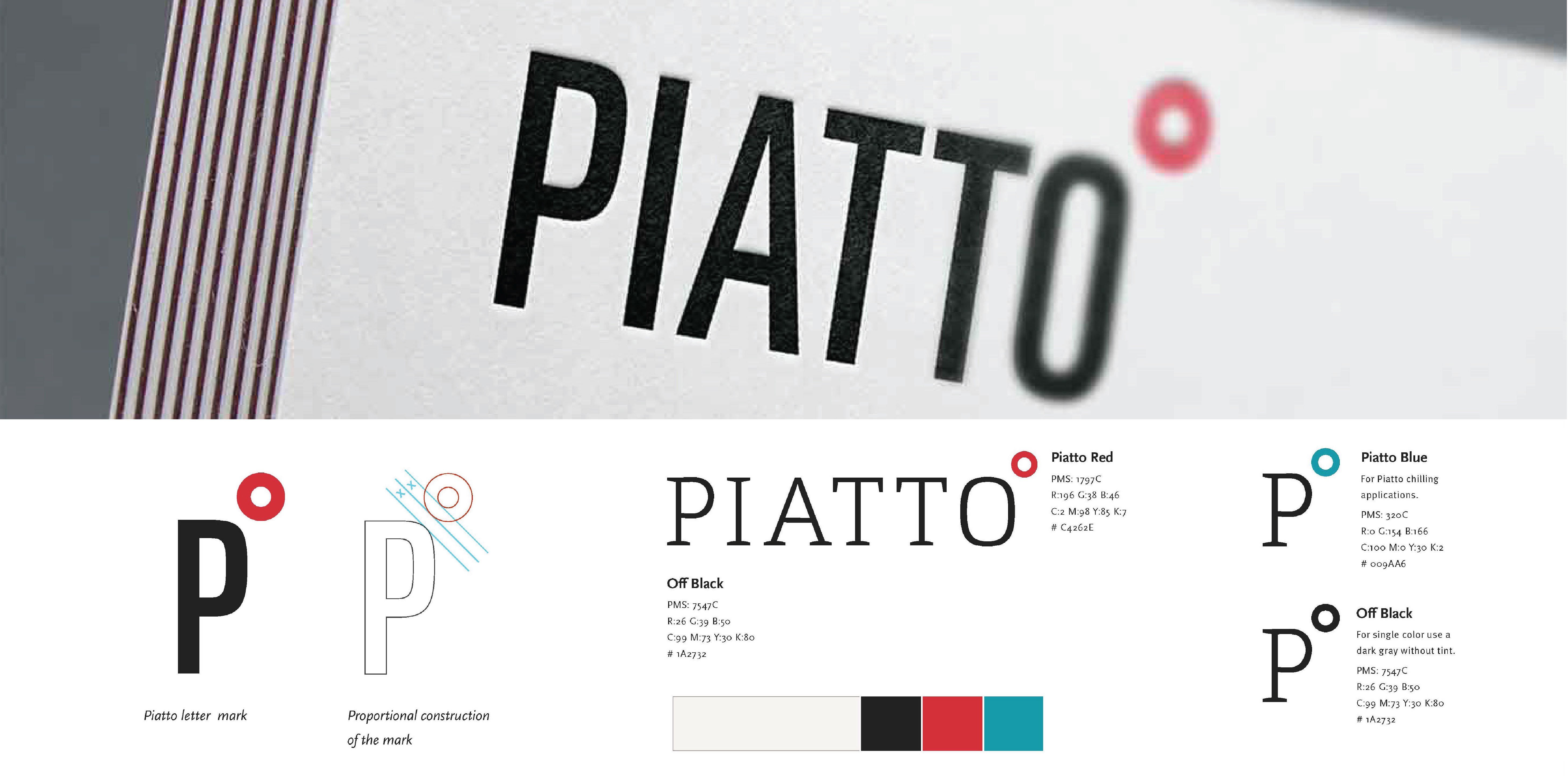
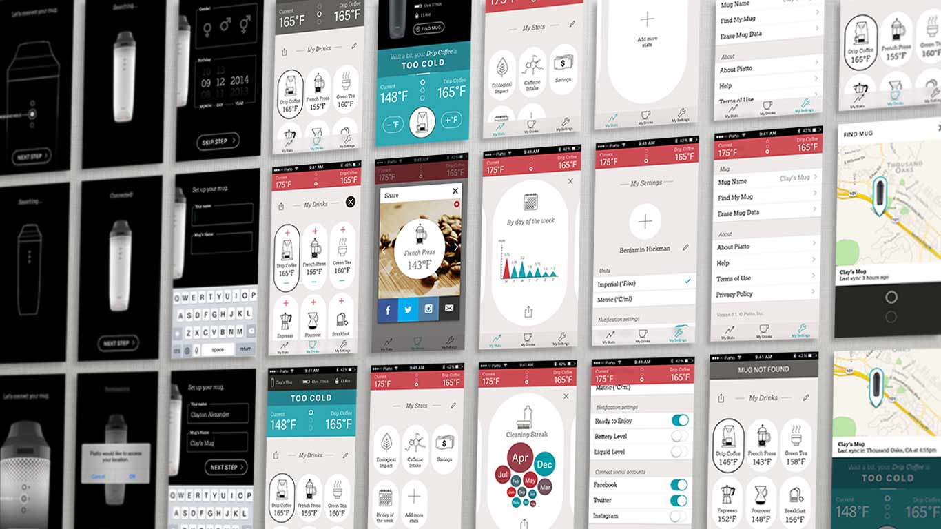
Our solutions encompassed a range of features and design elements. We developed a sleek and classic logo mark that reflected the product's innovative nature while maintaining a timeless appeal. The packaging was designed to be lively and eye-catching, effectively communicating the product's benefits at first glance. For the app, we created an engaging interface that allowed users to easily set and monitor their preferred beverage temperatures. The hardware itself was engineered to precisely maintain the user's desired temperature, incorporating advanced thermal technology with an intuitive user experience.
Outcomes
The final result was a distinguished brand identity that successfully communicated Manrke's core values of intellect, trustworthiness, and premium quality, while also conveying a modern and approachable image. The new visual identity set Manrke apart from competitors, positioning them as a forward-thinking firm in the CPA industry. Client feedback indicated that the brand effectively balanced professionalism with approachability, helping Manrke attract a diverse range of clients seeking a fresh approach to financial services.

What I Learned
Working on the Piatto as a UX/UI Designer taught me the importance of seamlessly integrating physical product design with digital interfaces to create a cohesive user experience. I learned to balance innovative features with user-friendly design, ensuring that advanced technology remains accessible to a wide range of users. Additionally, this project reinforced the value of comprehensive research and persona development in creating a product that truly addresses diverse user needs and sets new standards in the market.

Manrke
Redefining the CPA Firm Brand
Manrke is a global professional CPA firm that stands out in the industry with its energetic yet professional approach. The company sought to create a brand identity that would reflect their unique personality while maintaining the trustworthiness expected in the financial sector. This project aimed to develop a brand language that would position Manrke as a pioneer in a traditionally conservative industry.
Role: UX/UI Designer
Shipped: 2014
Keyword: UX Research, User Testing, Design System, UX/UI Design
My Role
As the UX/UI designer for the Piatto project, I was responsible for creating a cohesive user experience across multiple touchpoints. My role encompassed designing the user interface for the companion app, developing the product's branding, and ensuring a seamless integration between the physical product and digital interface. I collaborated closely with the product design team to align the app's functionality with the tumbler's features, creating an intuitive and engaging user experience.
Challenge
The primary challenge in developing Piatto was to create a product that would set the standard in the smart tumbler market. We faced the complex task of integrating multiple disciplines, including branding, packaging, and app design, simultaneously. Additionally, we needed to balance innovative features with user-friendly design, ensuring that the final product would be both technologically advanced and accessible to a wide range of users. The pressure to deliver a groundbreaking product that would stand out in a competitive market was significant.

Research
Our research phase began with an extensive analysis of existing high-quality tumblers and an investigation into the habits of coffee and tea drinkers. We combined this initial research with our client's knowledge of the product market to create a holistic user experience. Through this process, we identified key attractors and design criteria based on existing tumbler problems, which helped us stay focused on creating the best possible product. We also developed four distinct personas covering a wide range of demographic users and their specific issues with tumblers, ensuring our design would address diverse needs.
Ideate
During the ideation phase, our client and design teams utilized the personas and solution criteria to generate initial concepts for both the hardware and product app. We created mood boards, developed brand identity concepts, explored packaging ideas, and drafted app architecture information and wireframes. This comprehensive approach allowed us to visualize the entire user experience from multiple angles. We also mapped out a detailed customer journey, identifying all the possibilities an end-user might encounter from their first interaction with Piatto to repeated use over time.
Solution
Our solutions encompassed a range of features and design elements. We developed a sleek and classic logo mark that reflected the product's innovative nature while maintaining a timeless appeal. The packaging was designed to be lively and eye-catching, effectively communicating the product's benefits at first glance. For the app, we created an engaging interface that allowed users to easily set and monitor their preferred beverage temperatures. The hardware itself was engineered to precisely maintain the user's desired temperature, incorporating advanced thermal technology with an intuitive user experience.

Outcomes
The final result was a distinguished brand identity that successfully communicated Manrke's core values of intellect, trustworthiness, and premium quality, while also conveying a modern and approachable image. The new visual identity set Manrke apart from competitors, positioning them as a forward-thinking firm in the CPA industry. Client feedback indicated that the brand effectively balanced professionalism with approachability, helping Manrke attract a diverse range of clients seeking a fresh approach to financial services.


What I Learned
Working on the Piatto as a UX/UI Designer taught me the importance of seamlessly integrating physical product design with digital interfaces to create a cohesive user experience. I learned to balance innovative features with user-friendly design, ensuring that advanced technology remains accessible to a wide range of users. Additionally, this project reinforced the value of comprehensive research and persona development in creating a product that truly addresses diverse user needs and sets new standards in the market.

Manrke
Redefining the CPA Firm Brand
Manrke is a global professional CPA firm that stands out in the industry with its energetic yet professional approach. The company sought to create a brand identity that would reflect their unique personality while maintaining the trustworthiness expected in the financial sector. This project aimed to develop a brand language that would position Manrke as a pioneer in a traditionally conservative industry.
Role: UX/UI Designer
Shipped: 2014
Keyword: UX Research, User Testing, Design System, UX/UI Design
My Role
As the UX/UI designer for the Piatto project, I was responsible for creating a cohesive user experience across multiple touchpoints. My role encompassed designing the user interface for the companion app, developing the product's branding, and ensuring a seamless integration between the physical product and digital interface. I collaborated closely with the product design team to align the app's functionality with the tumbler's features, creating an intuitive and engaging user experience.
Challenge
The primary challenge in developing Piatto was to create a product that would set the standard in the smart tumbler market. We faced the complex task of integrating multiple disciplines, including branding, packaging, and app design, simultaneously. Additionally, we needed to balance innovative features with user-friendly design, ensuring that the final product would be both technologically advanced and accessible to a wide range of users. The pressure to deliver a groundbreaking product that would stand out in a competitive market was significant.

Research
Our research phase began with an extensive analysis of existing high-quality tumblers and an investigation into the habits of coffee and tea drinkers. We combined this initial research with our client's knowledge of the product market to create a holistic user experience. Through this process, we identified key attractors and design criteria based on existing tumbler problems, which helped us stay focused on creating the best possible product. We also developed four distinct personas covering a wide range of demographic users and their specific issues with tumblers, ensuring our design would address diverse needs.
Ideate
During the ideation phase, our client and design teams utilized the personas and solution criteria to generate initial concepts for both the hardware and product app. We created mood boards, developed brand identity concepts, explored packaging ideas, and drafted app architecture information and wireframes. This comprehensive approach allowed us to visualize the entire user experience from multiple angles. We also mapped out a detailed customer journey, identifying all the possibilities an end-user might encounter from their first interaction with Piatto to repeated use over time.
Solution
Our solutions encompassed a range of features and design elements. We developed a sleek and classic logo mark that reflected the product's innovative nature while maintaining a timeless appeal. The packaging was designed to be lively and eye-catching, effectively communicating the product's benefits at first glance. For the app, we created an engaging interface that allowed users to easily set and monitor their preferred beverage temperatures. The hardware itself was engineered to precisely maintain the user's desired temperature, incorporating advanced thermal technology with an intuitive user experience.

Outcomes
The final result was a distinguished brand identity that successfully communicated Manrke's core values of intellect, trustworthiness, and premium quality, while also conveying a modern and approachable image. The new visual identity set Manrke apart from competitors, positioning them as a forward-thinking firm in the CPA industry. Client feedback indicated that the brand effectively balanced professionalism with approachability, helping Manrke attract a diverse range of clients seeking a fresh approach to financial services.


What I Learned
Working on the Piatto as a UX/UI Designer taught me the importance of seamlessly integrating physical product design with digital interfaces to create a cohesive user experience. I learned to balance innovative features with user-friendly design, ensuring that advanced technology remains accessible to a wide range of users. Additionally, this project reinforced the value of comprehensive research and persona development in creating a product that truly addresses diverse user needs and sets new standards in the market.


